
Something Like Taste
Slop happens when you don't ask questions

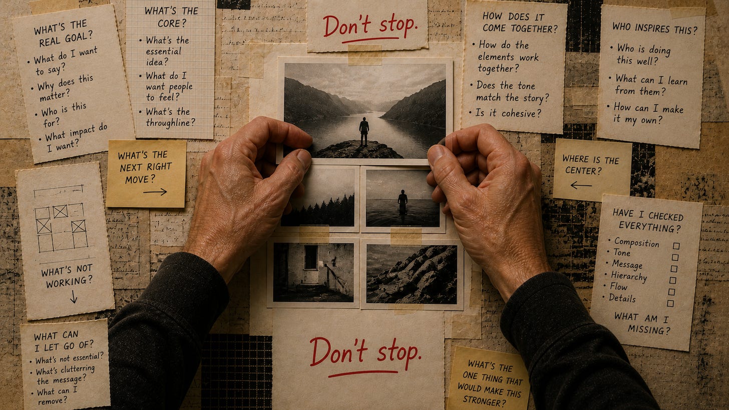
One thing about AI that makes me want to rapidly poke a dagger into my eyes is image generation. There’s so much slop out there and it all looks the same. It’s just the lowest common denominator in jpg form. I fucking hate them. Wait here while I induce some vomiting.
Maybe I should start this issue over.
You know what could use some work? Image generation. Sure, it’s fun to type in some random words to plop out an image, but what are you getting, really? Are you proud of yourself for what you did? Are you?
OK, Steve. Stop. Be positive. Remember the point of this publication.
Alright.
(exhale)
Let’s talk about taste. That’s a word that keeps popping when experts talk about AI and creativity. As in, people have it and AI does not.
That’s not true.
Not all people have taste.
Our great American philosopher Ben Affleck once said, “AI is a craftsman at best…Craftsman is knowing how to work. Art is knowing when to stop. And I think knowing when to stop is going to be a very difficult thing for AI to learn because it’s taste.”
Or simplified: The difference between AI and people is that AI has craft, and people have taste. Craft knows how to start, and taste knows when to stop.
That’s so very true, but there’s a huge difference in what’s tasteful. I just spent a week in Paris for work, and almost every storefront I passed by was a masterpiece in design, fonts and spatial relationships. And yet, when I visit my hometown in Staten Island, every awning of every storefront I drive past is a shit pie of messaging, default fonts from the 1980s and a design style that can best be described as “cram it all in, dammit”.
Taste isn’t a basic human quality. It’s something that’s learned, embedded and part of the culture you’re surrounded by. It’s tested and refined, and it’s specific to you but relatable to everyone.
Here’s the downer:
Although you might think you have taste, you probably don’t have it. And I can’t teach you to have some.
But what I can teach you is to ask better questions to help you move your design from awful to somewhat acceptable. I can give you more options so you have a better chance of recognizing the right one when you see it.
One way you can do this is to develop a creative brief for your image generation, which would absolutely work. This is the crucial part of having taste, which is knowing what you want and what works. But, to be honest, since I already went through the entire brief process in Issue 2, I’m going to develop something else: a vision statement.
How I describe a vision statement is a long sentence that captures what the end goal of an execution should be built from. Starting with a short vision statement is okay, because as you explore, you should build upon it to create a sentence that is robust, thoughtful and able to get you where you need to go. In fact, that’s what we’re gonna do here.
So let’s think about what a vision statement for this header image would be. How about this:
I want to create an image that can be used as the header for this issue that portrays people controlling the loop with AI supporting them.
This is pretty basic, but it’s also where most people would start. And it could also work as a prompt.
So let’s throw that into our AI models and see what they come up with.
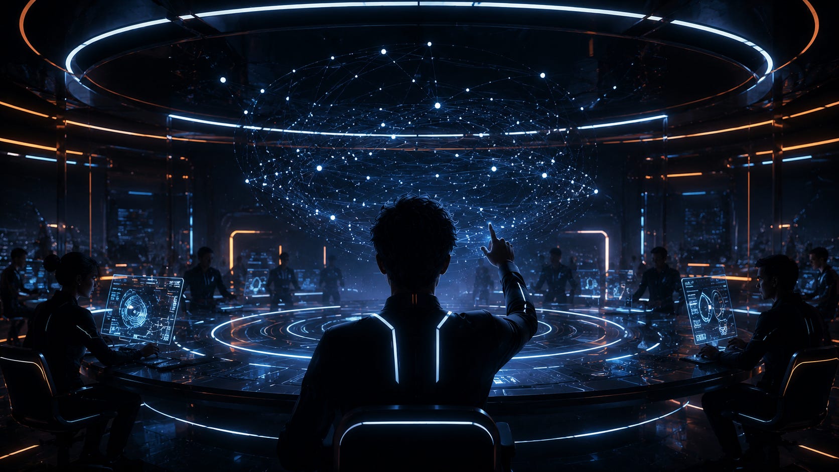
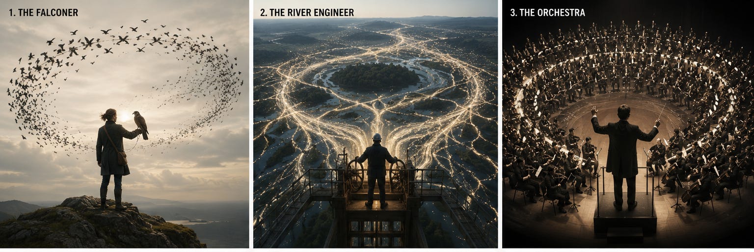
You should never ever stop after the first generation.
So the goal is to create more options. You just need to be honest about what you’re looking at. And the easiest question to ask is always some version of the same thing: What’s the opposite of what was just pumped out?
Too dark? Ask for light. Too literal? Ask for abstract. Too cold? Ask for warm. Too busy? Ask for simple. Too retro? Ask for modern. Too posed? Ask for candid. Too wide? Ask for close.
That’s a move that anyone can do. Each flip generates a new round of options. And more options means more chances to land on something that feels right, even if you can’t explain why yet.
So let’s look for opposites, just because it’s the easiest way forward.
In this round, we see something Tron-ish, which is how people immediately think about AI for some bizarre reason. And that always gets me because “Tron” is more about software programs and digital worlds. Duh.
So what’s the opposite of “Tron”? Maybe, I dunno, “Legally Blonde”? “A River Runs Through It” is about fly fishing, so maybe that? How about “Godzilla vs. Mothra?” You know what, I’m getting nowhere with this train of thought other than becoming agitated. It’s okay to move on.
So what else?
One of the basic rules of creativity is that if everyone else is coming up with the same idea, it’s a first thought, and you can do better, so start over and come up with more options. So let’s look for patterns.
Well, there’s a lot of loops and circles.
There’s a lot of lights.
There’s a lot of seeing the backsides of people.
Now that’s some meat to chew on.
So let's add these opposites to the vision statement. What’s in CAPS is new.
I want to create an image that can be used as the header for this issue that portrays people controlling the loop with AI supporting them, BUT WE DON’T HAVE TO USE ANY METAPHORS LIKE LIGHT FOR AI, AND WE DON’T HAVE TO LITERALLY SHOW SOMEONE INSIDE OF A LOOP, AND NO BACKSIDES OF PEOPLE.
Let’s see what our models come up with.
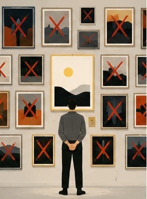
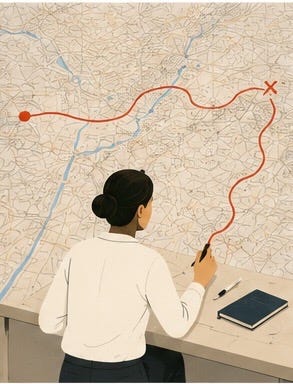
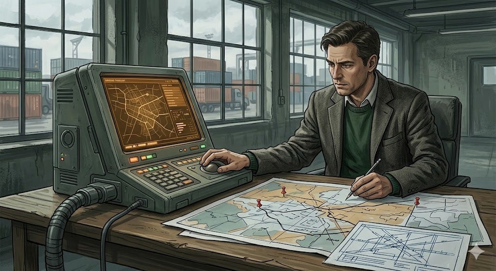
OK, interesting in an “Archer” meets “The New Yorker” sorta way. We still got some backsides, so we at least we now know what our AI models have a fetish about. I’m not seeing anything that can be interpreted into a system, but I think the stories are getting a little more…human, I guess? And it’s odd that we’re in an illustration world for all of these. Maybe photography would make this more human.
That’s a good word. Let’s add onto our vision statement. I capped the added parts.
I want to create a PHOTOGRAPH that can be used as the header for this issue that portrays people controlling the loop with AI supporting them, but we don’t have to use any metaphors like light for AI, and we don’t have to literally show someone inside of a loop, BUT THEY ARE DOING SOMETHING HUMAN THAT WE CAN ALL RELATE TO, LIKE AN ART PROJECT. AND NO BACKSIDES OF PEOPLE, YOU PERV.
Show me the renders:
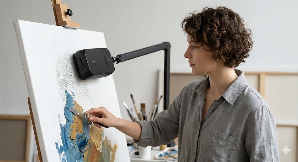

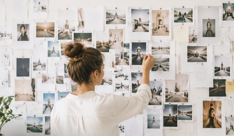
Now we’re really getting somewhere. Personally, I’m getting closer to being bored to death with this output. But that’s a “me” thing. As for you, yes, you could stop here, but let’s not be most people. I think we can go even deeper. Again, look for similarities, and then ask for the opposite. Or maybe something new pops in your head. Ideas beget more ideas.
So what do we see?
The lighting is really bright, for one.
The projects are almost too basic and don’t really need any sort of computer help. (Yawn)
And we’re looking at either behind the people or at a side angle. What if we changed the POV? That’s “Point of View” for the uninitiated.
Again, I’m looking at these images through trained eyes, and it’s an unfair advantage that I have over someone who doesn’t do this for a career. But the point remains: The more options you give yourself, the better your chances of landing somewhere worth stopping.
So let’s advance this some more:
I want to create a DARKLY-LIT, ALMOST VINTAGE photograph that can be used as the header for this issue that portray the POV OF A PERSON controlling the loop with AI supporting them, but we don’t have to use any metaphors like light for AI, and we don’t have to literally show someone inside of a loop, but they are doing something human that we can all relate to, EXCEPT THE PROJECTS ARE THINGS THAT YOU WOULD NEED A COMPUTER’S HELP WITH. And no backsides, although you really want to.
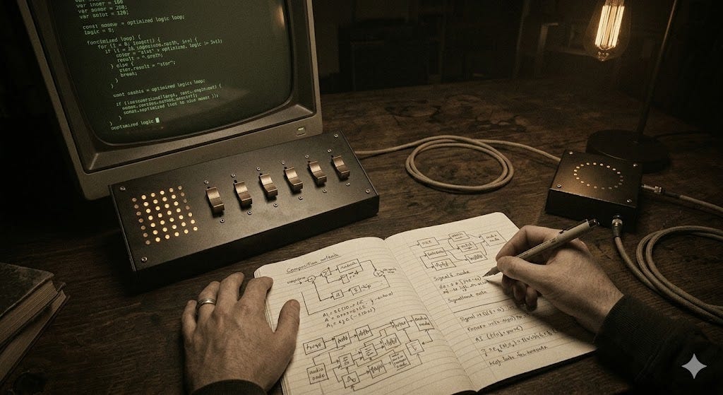
OK, thematically, it’s getting somewhere interesting, and it’s a far cry from where we started, which is a good thing. I think we can agree that it’s too retro and too dark. Also, is that a Radio Shack Tandy computer? There’s no keyboard. HAL? Are you there? What’s going on?
OK but seriously, let's not lose the thread here. When the opposite move isn't getting you anywhere, try these. Here are a few more questions worth asking when you’re stuck:
What emotion do you want the image to create? Not what you want it to show. It’s what you want the viewer to feel. Work backwards from that.
What’s missing? Sometimes you can’t name what’s wrong, but you know something isn’t there. Trust that instinct. Ask for it explicitly.
What would a completely different audience think? You’re making this for executives and founders. So, what would a 22-year-old art student say about it? What would your mom say? Honestly, if it were my mom, it would have been some version of “I don’t get it but I love you and I guess this is what you do for a living again?”
The discomfort of those answers tells you something.
None of these require taste. They just require honesty. And honesty, it turns out, is a pretty good substitute.
But there’s something interesting in the moodiness, yes? Maybe it’s not right, but it’s something. Is there another word for it?
Let’s give it one more whirl.
I want to create a MOODY, ALMOST VINTAGE photograph that can be used as the header for this issue that portray the POV of a person controlling the loop with AI supporting them, but we don’t have to use any metaphors like light for AI, and we don’t have to literally show someone inside of a loop, but they are doing something human that we can all relate to, EXCEPT THE PROJECTS ARE THINGS THAT YOU WOULD NEED A COMPUTER’S HELP WITH, AND EVEN THOUGH THE PHOTO STYLE IS VINTAGE, EVERYTHING IN THIS PHOTO IS FROM THE MODERN WORLD. And the no butt thing, which I shouldn’t have to say anymore but it’s clearly what you love the most in the world.
Let’s roll.
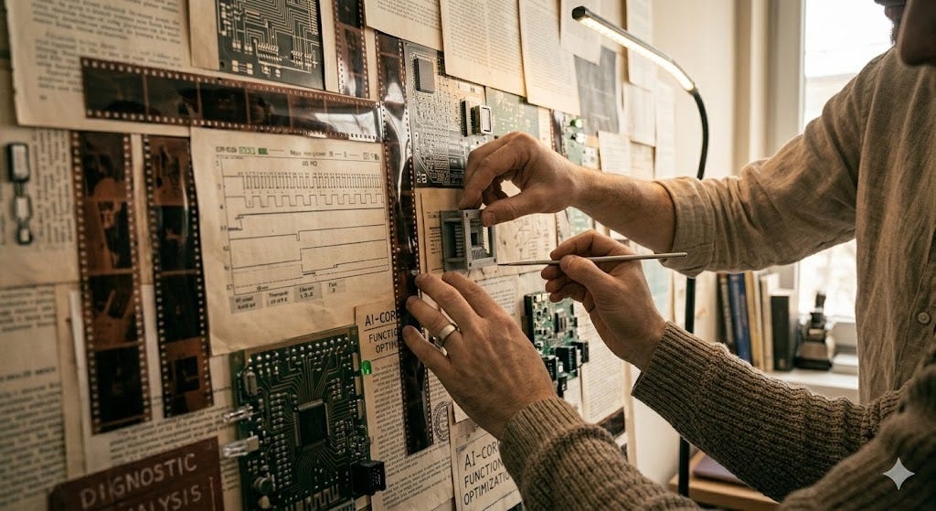
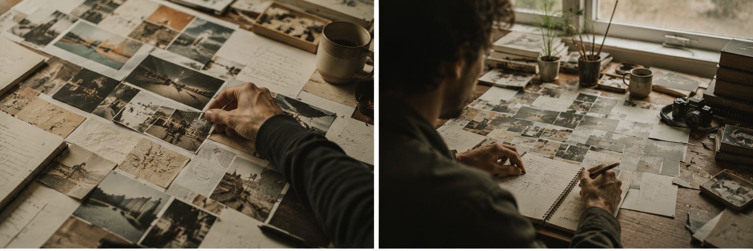
I think we’re getting to a good place. How do I know that? Well, I’ve been doing this work for 25 years for some of the most influential brands in the world, working under some of the most accomplished creative directors in the industry, deep diving through design decision making on a daily basis, all powered by an overzealous anxiety disorder. If you know, you know.
And even if you don’t have that experience or taste, (or you think you do, but deep in your heart you know you’re a fraud), you’ve gotten yourself to a more interesting place from where you started, just by asking questions.
Now that I have this, let’s tell the models to keep this as a creative theme, but to render out options based on a synopsis of what this specific issue is about.
Remember, we started here:
And here’s where I ended up, with the header at the top. When I landed on this one, I didn't celebrate. I just stopped. That's how you know. Not excitement. Just the absence of the urge to keep going. That's taste doing its job.
OK, I’ll put it right here so you don’t have to scroll all the way up, because I’m a nice guy:

In fact, take a look at all of the header images at the top of every issue of “Control the Loop” so far. They’re all different, but they all come from the same base idea. That’s intentional. They’re designed to family together. Much like the topics, voice and tone in this publication, they can collectively tell a story.
And let’s be real: Getting to that place wasn’t easy. That’s vision and taste coming together in 1456 x 813 pixelized goodness. It took a lot of work. But getting something better than slop should be the basic starting point.
And now, you have a way forward. Unlike most people.